What Makes a Website Conversion-Focused?
A conversion-focused website aligns message, structure, proof, speed, and calls to action around the decisions visitors need to make.
This article is an editorial preview. Publication readiness, attribution, and indexing approval are incomplete, so this page remains noindex.
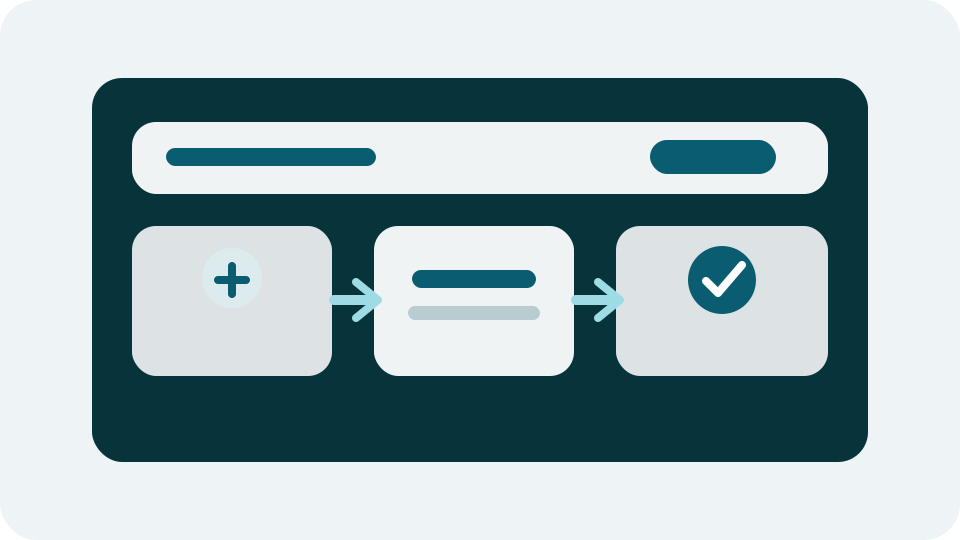
Conversion focus is more than a button
A conversion-focused website is not defined by how many buttons it has. It is defined by how well the page helps a visitor understand the offer, trust the business, and choose the next step that fits their intent.
For a service business, a conversion might be a proposal request, contact form submission, phone call, or consultation booking. For ecommerce, it might be product discovery, cart completion, or a repeat purchase path. The design should support the most important action without creating pressure or confusion.
Message match creates momentum
Visitors arrive with expectations from search results, referrals, ads, social posts, or direct recommendations. The page needs to confirm quickly that they are in the right place. A clear headline, relevant supporting copy, and visible next step prevent the visitor from having to decode the offer.
When the message is too broad, visitors may leave even if the business can help them. Specific language builds confidence faster.
Trust signals and friction both matter
A conversion-focused page answers the small questions that can stop action. What does the company do? Who is it for? What happens after I reach out? Is the site credible? Is the form asking for the right amount of information?
The best pages reduce friction without hiding important details. They use proof, process, FAQs, transparent next steps, and readable layouts to make action feel reasonable.
- Use real proof when available, not generic claims.
- Make forms easy to scan and complete on mobile.
- Place CTAs after meaningful context, not only at the top.
- Keep page speed and layout stability strong.
Conversion is a site-wide system
One strong landing page helps, but conversion performance improves when the whole site supports the buyer journey. Navigation, related services, blog posts, case studies, industry pages, and contact paths should work together.
That system view is what keeps a website from feeling like a brochure. Every important page should have a purpose, an audience, and a next step.
Continue exploring
Related Guidance and Examples
Related articles
Read Next
Lead Generation
How to Structure Service Pages for Better Leads
Strong service pages explain the offer, answer buyer questions, build trust, and make the next step obvious without turning the page into a hard sell.
Ecommerce
Ecommerce UX Basics That Help Shoppers Decide Faster
Ecommerce UX should make product discovery, comparison, trust, and checkout feel clear on every screen size.